The global incidents feed
Incidents in the left nav shows every incident across every monitor you watch. This is the tab to keep open when something feels off — it's the widest view you have.
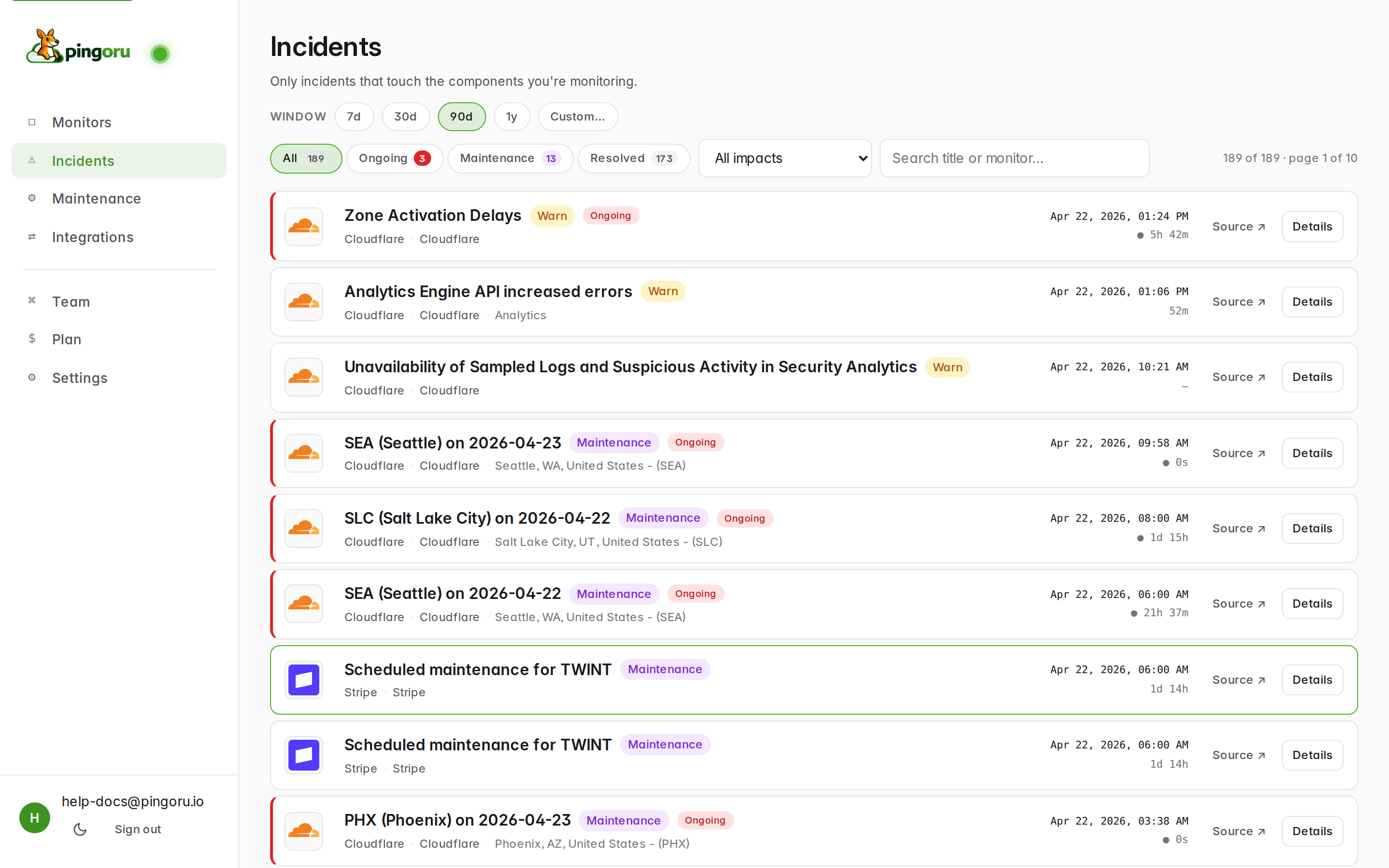
Filters
- Window — 7d / 30d / 90d / 1y / Custom. Controls the date range. Defaults to the last 7 days.
- Status chips — All, Ongoing, Maintenance, Resolved. Each shows a live count. "Ongoing" excludes maintenance so the number matches the Has issues count on the Monitors list.
- Impact filter — drop to just Major, just Minor, etc. Useful for producing an SLA-style monthly retrospective.
- Search — title + monitor name match.
What each row tells you
From left to right: provider logo, incident title, affected component or region, status pill (e.g. Warn / Down / Maintenance / Postmortem), start time, elapsed or resolved duration, Source → link to the vendor's original page, and Details to jump to our view.
The monitor detail page
Clicking any monitor row (or any incident's Details link) drops you into the per-monitor page. Everything about one provider lives here.
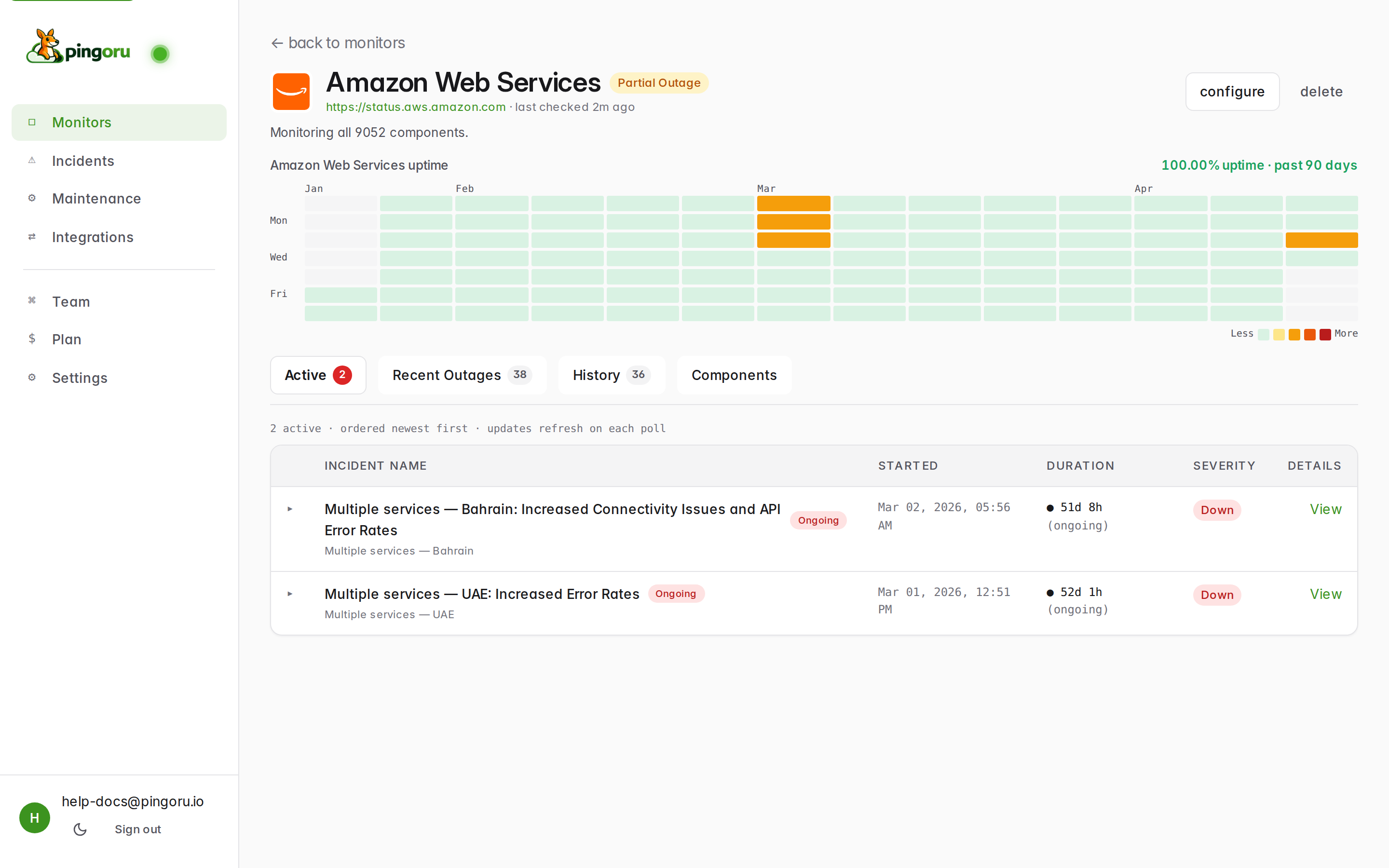
The uptime heatmap
The calendar grid at the top is a 90-day view. Each cell is one day. Darker-green is better uptime; orange / red cells highlight days with incidents. Hover any cell to see the breakdown. The 100.00% uptime number to the right is the rolled-up figure across everything you're watching on this monitor.
Tabs
- Active — open incidents right now, newest first. The badge in the tab label tells you how many.
- Recent Outages — incidents from the last 30 days, resolved or not. Good "what happened this month" view.
- Maintenance — scheduled and ongoing maintenance windows. See the maintenance guide.
- History — everything we've ever seen for this provider (up to your plan's retention). Paginated; newest first.
- Components — live per-component status. Great for narrowing down "which region" when AWS or Google Cloud is having a bad day.
Incident columns
Each incident row: name + affected component, state badge (Ongoing / Resolved / Postmortem), start time, duration, severity, and a View link that opens the full timeline with every update the vendor posted.
Status reference: what the pills mean
We normalize every vendor's wildly-different language into one vocabulary:
- Up — operational, no current issues.
- Degraded — performance issues but still working.
- Partial Outage — some components are down, others are fine.
- Major Outage — broad failure across most / all of the provider.
- In Maintenance — a maintenance window is running right now. This is a side-state: a provider can be "Up · In Maintenance" at the same time.
- Postmortem — the incident is over and the vendor has posted an explanation. Useful for SLA reporting.
The meaning follows whatever the vendor's page says. We don't second-guess their classification — "Partial Outage" on our monitor means at least one service they track is in that state on their page. Click through to Source for the original version.
Didn't find what you needed? Let us know — we'll add it to the guides.